Identity design and publication design
Designing a playful identity for learning materials used in challenging environments
Client: UNICEF
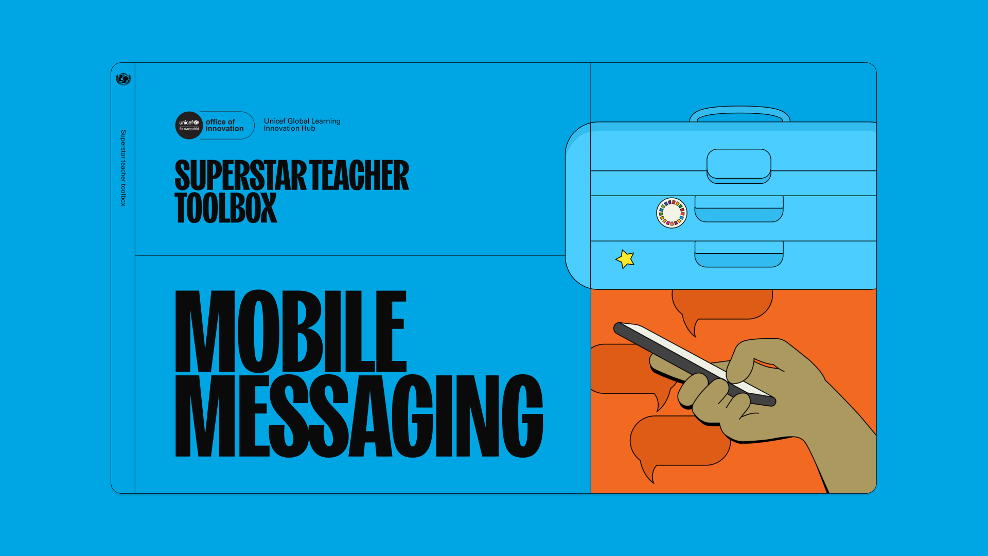
Project: Superstar Teacher Toolbox
Year: 2023
The UNICEF Global Learning Innovation Hub wanted to create a toolbox for teachers, consisting of guides on topics such as using mobile messaging for teaching. The Superstar Teacher Toolbox was to encompass several interactive and accessible PDFs, one PDF for each tool.
Adventure Club was tasked with creating an identity for the toolbox and its contents. The client was looking for a solution that would be interactive, playful, and distinct from other UNICEF materials – yet in keeping with the overall brand colors.
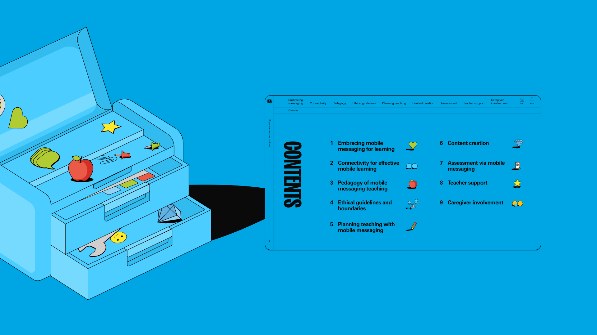

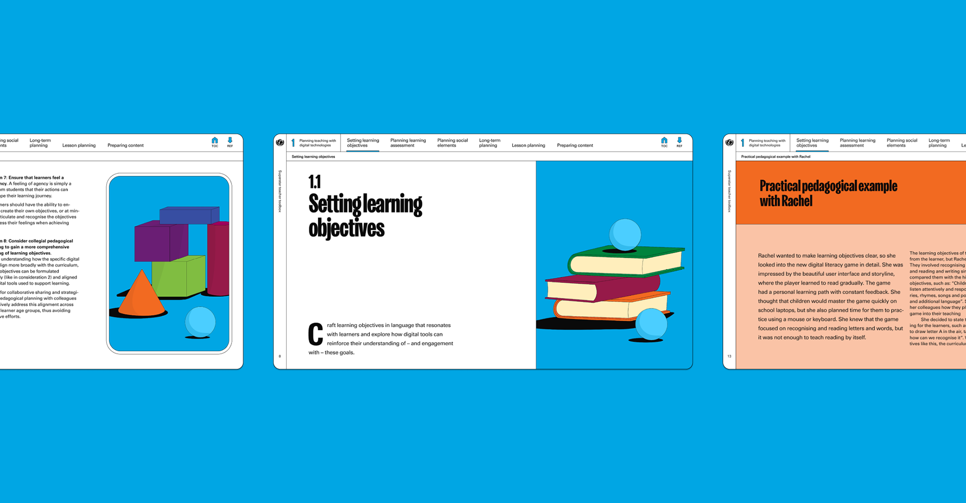
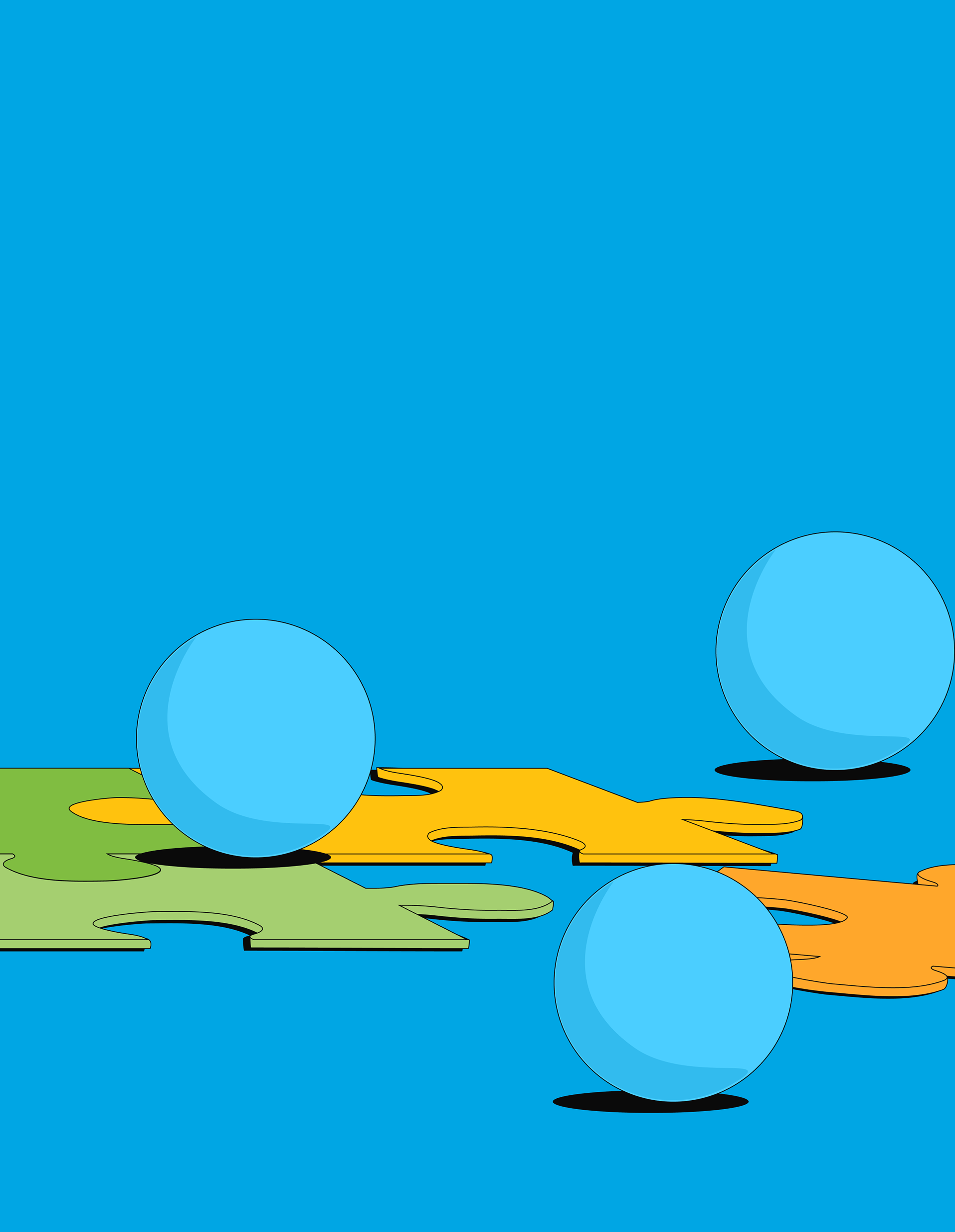
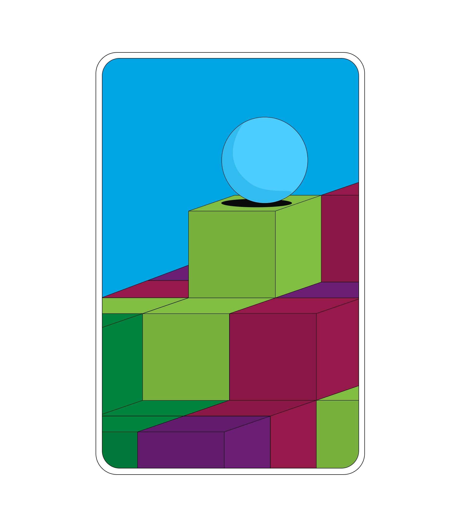
Toolboxes encompass a number of tools, allowing the user to select the one that best suits their needs. A toolbox contains shelves and compartments, each item neatly in its place.
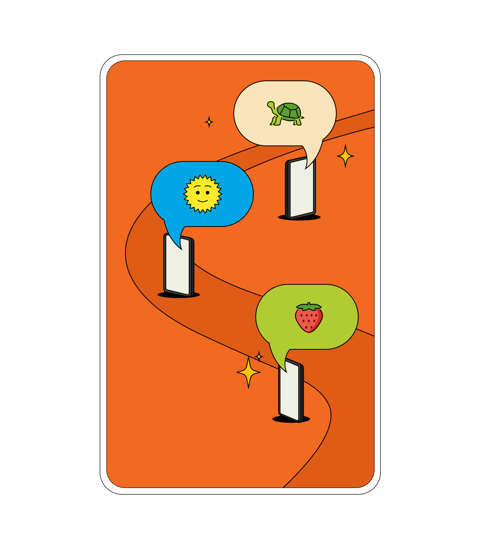
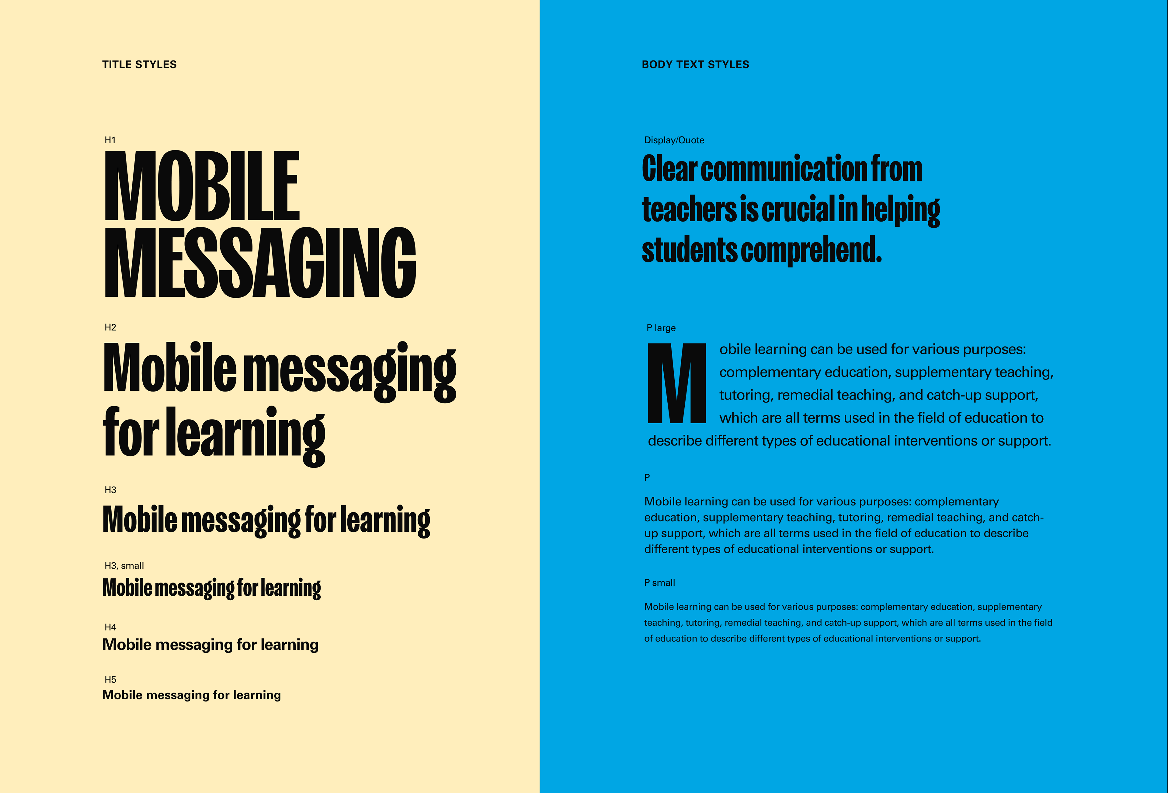
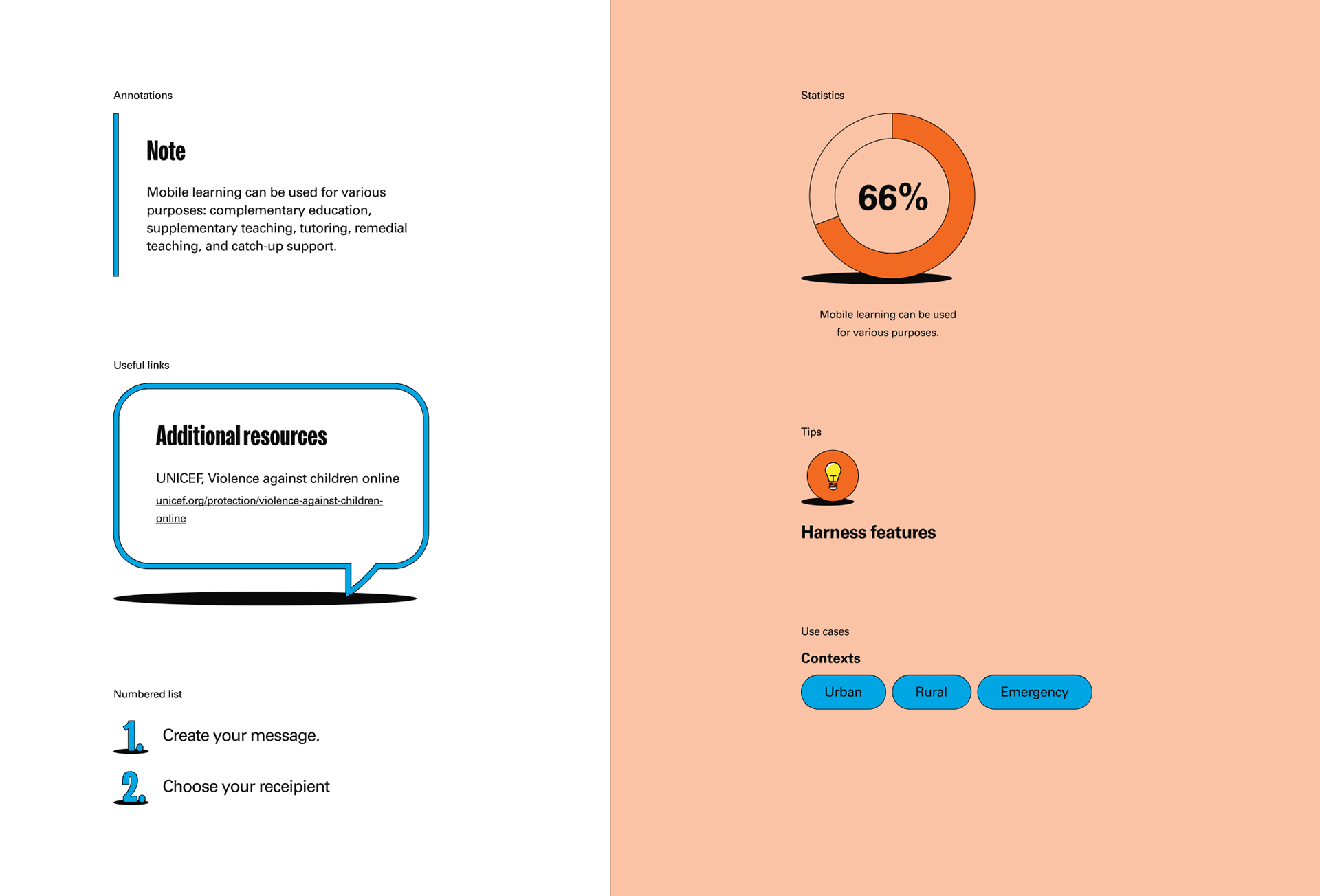
The choice of toolbox as symbol informed the design, represented through lines that separated navigation, content and illustrations. This allowed for a clear, contemporary design offset by fun emojis and 90's retro illustrations, creating a bit of contrast to the digital heavy content of the toolbox.
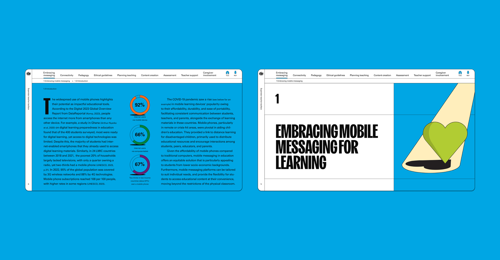
But how to bring the superstar of it all into them? We decided to treat teachers are the superstars they are, creating building blocks for the future. Each chapter was given an interactive spotlight that appeared on hover, shining a light on the topic in the chapter – effectively placing it on a pedestal.
A single tool encompassed 90 pages, with much variation in chapter content and length. My task, in addition to creating a general identity for the toolbox and its tools was to create the editorial content for two finished tools, Mobile Messaging and Digital Pedagogy, totaling 180+ pages.
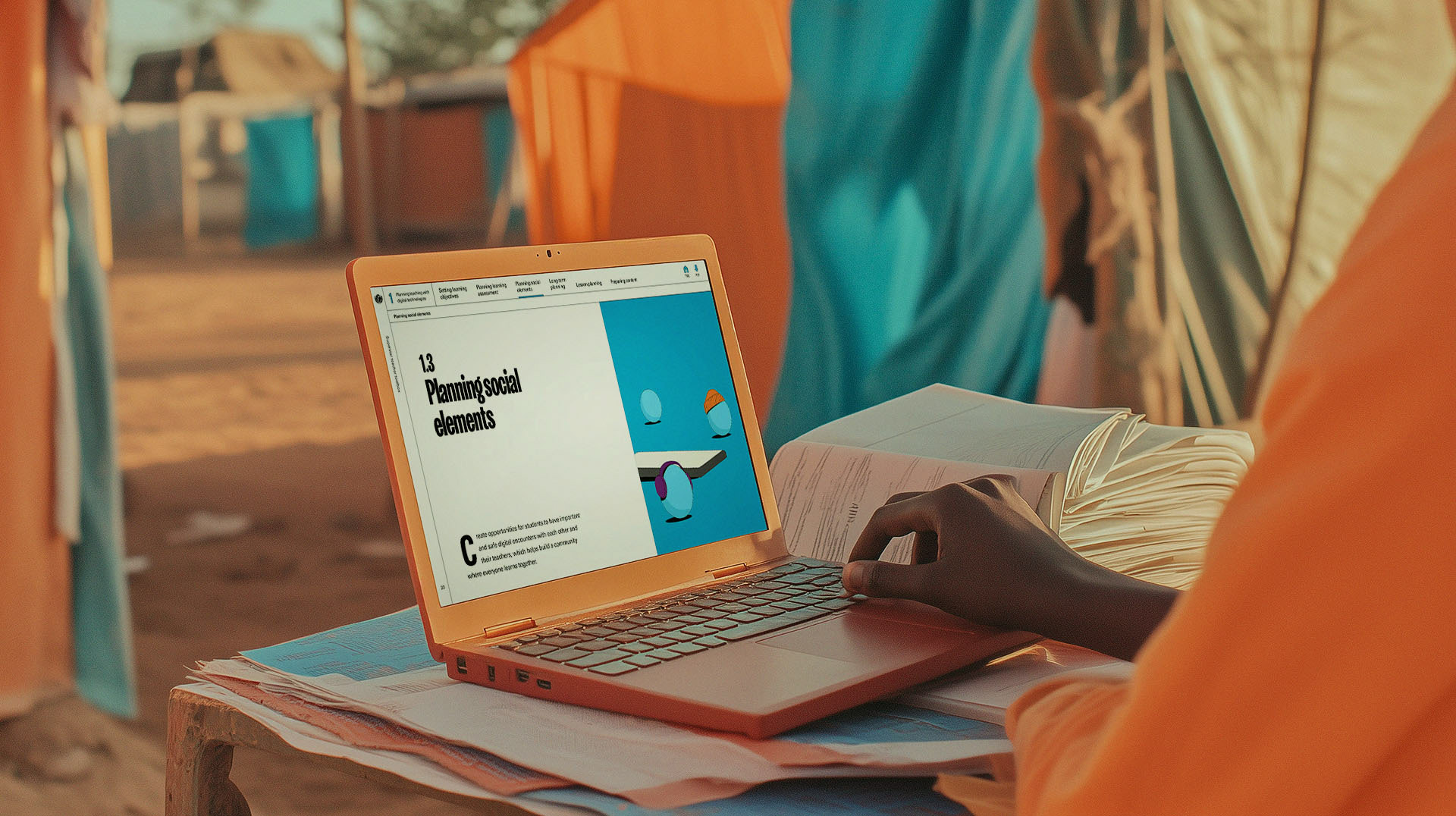
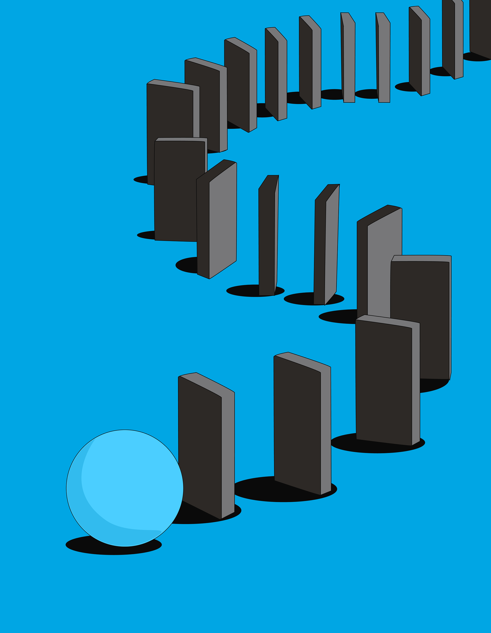
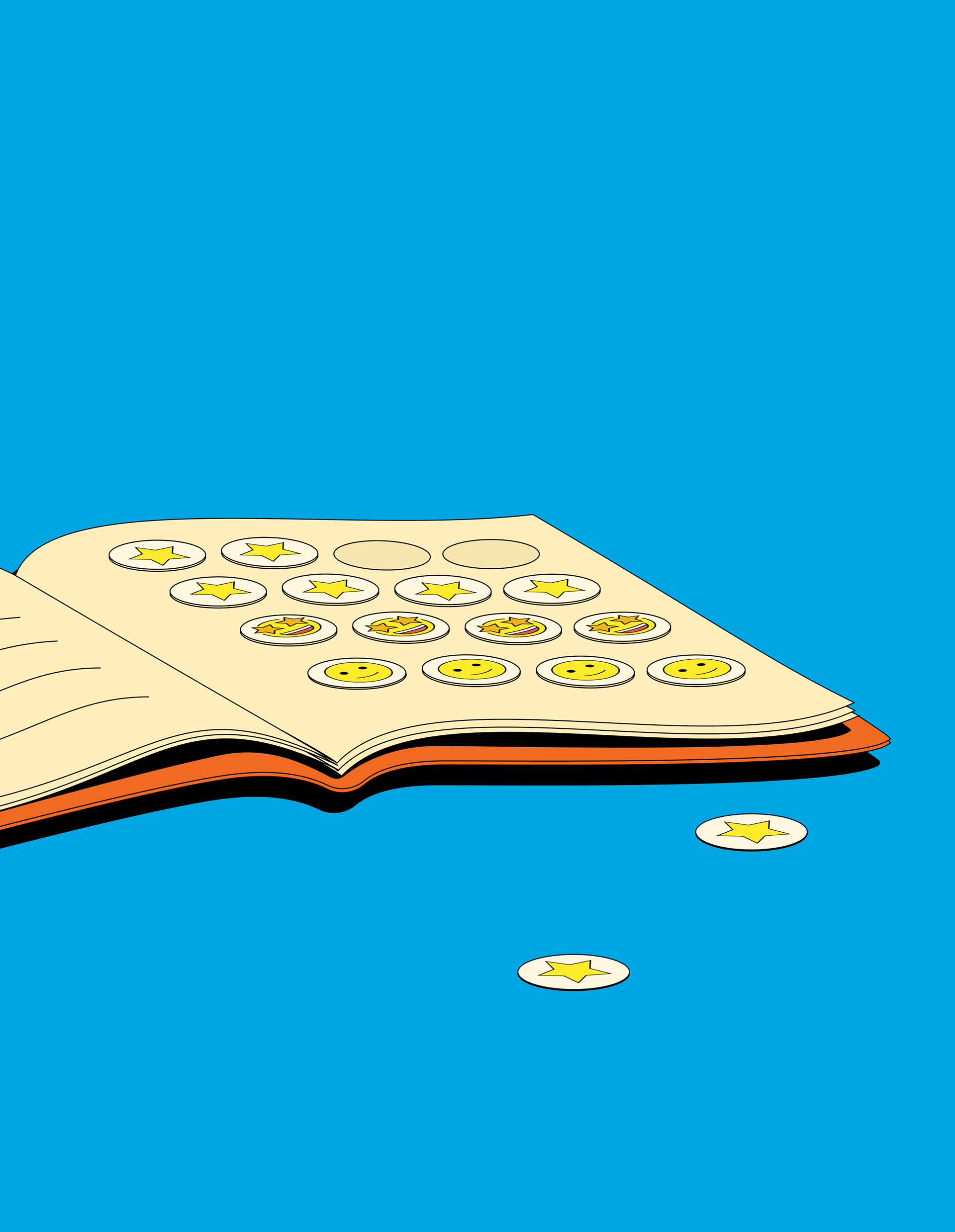
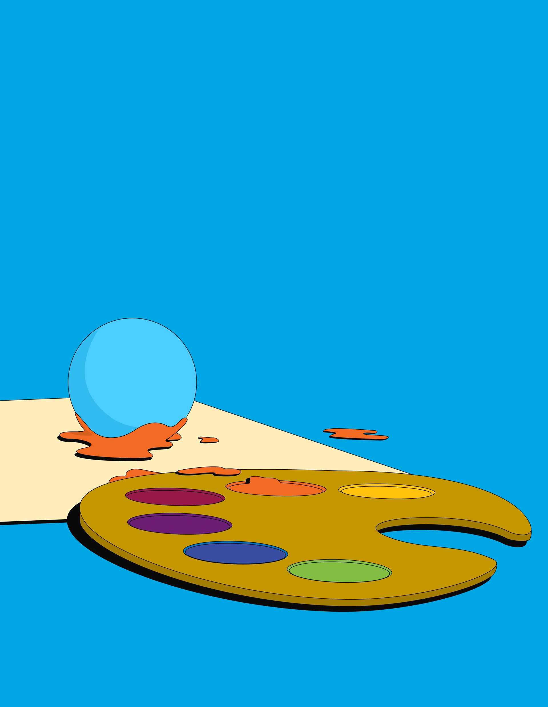
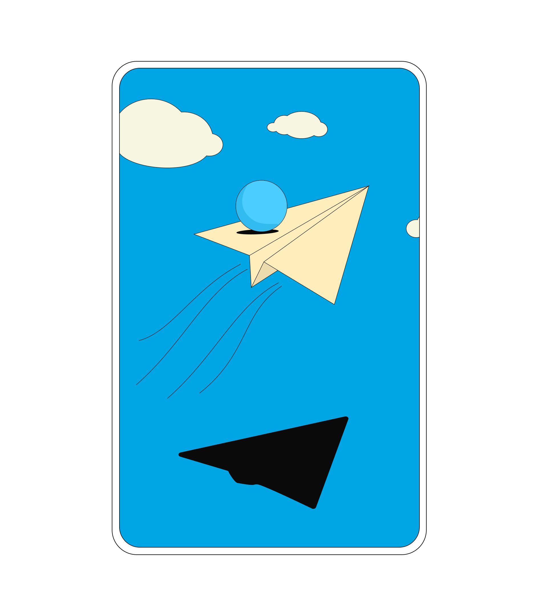
To help space out the text and let the reader breathe in between chapters and sections, a number of illustrations were created. The scope of the project did not allow much time for illustration, so I settled on a solution that would be quick to create and versatile enough to serve across any future illustrations needs. UNICEF operates internationally in a number of different cultures, so I wanted to depict young learners in a way that would encompass all nationalities and ethnicities. As blue is the color used to represent children in UNICEF's branding, I chose a blue sphere to symbolize children.
This allowed for a level of playfulness that could later easily be expanded to include motion, allowing the spheres to roll, jump, spin and collide.