Identity design and webdesign
Helping an ESG consultancy gain credibility
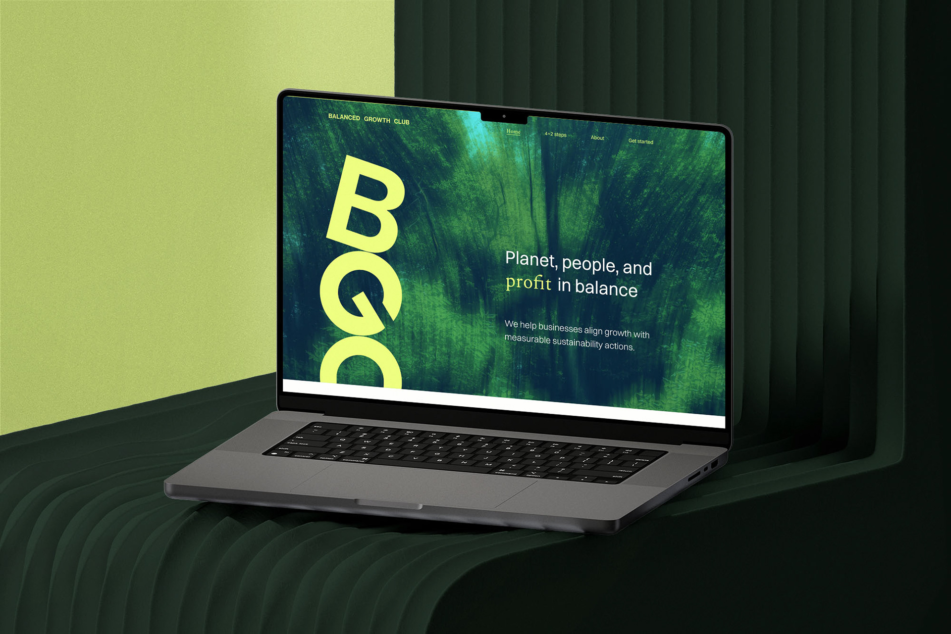
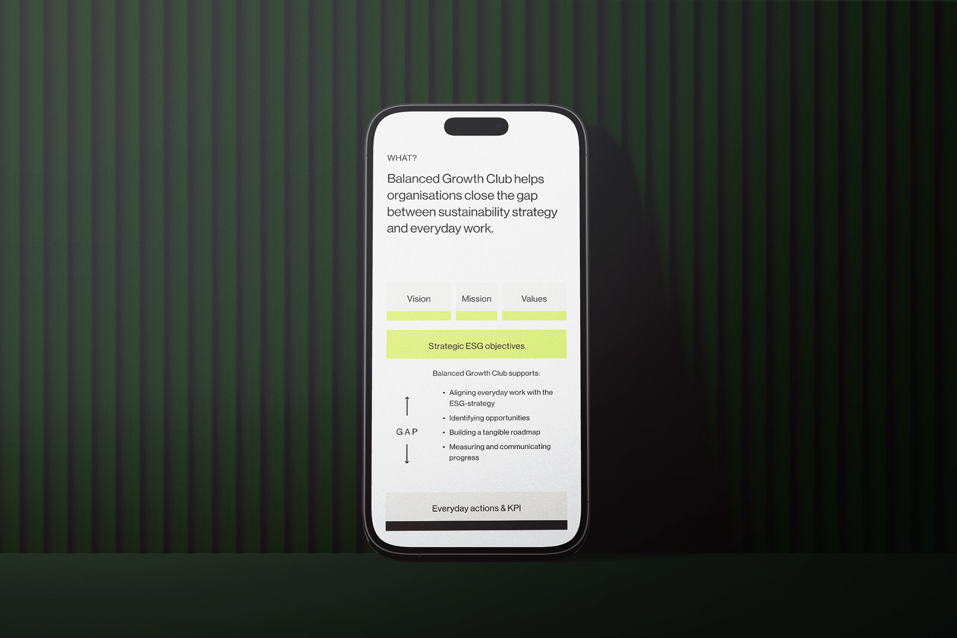
Client: Balanced Growth Club
Project: Balanced Growth Club rebrand
Year: 2023
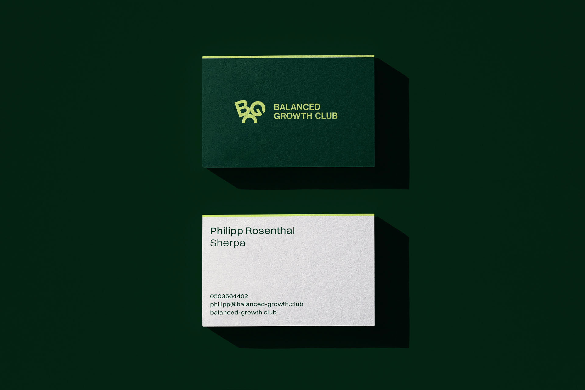
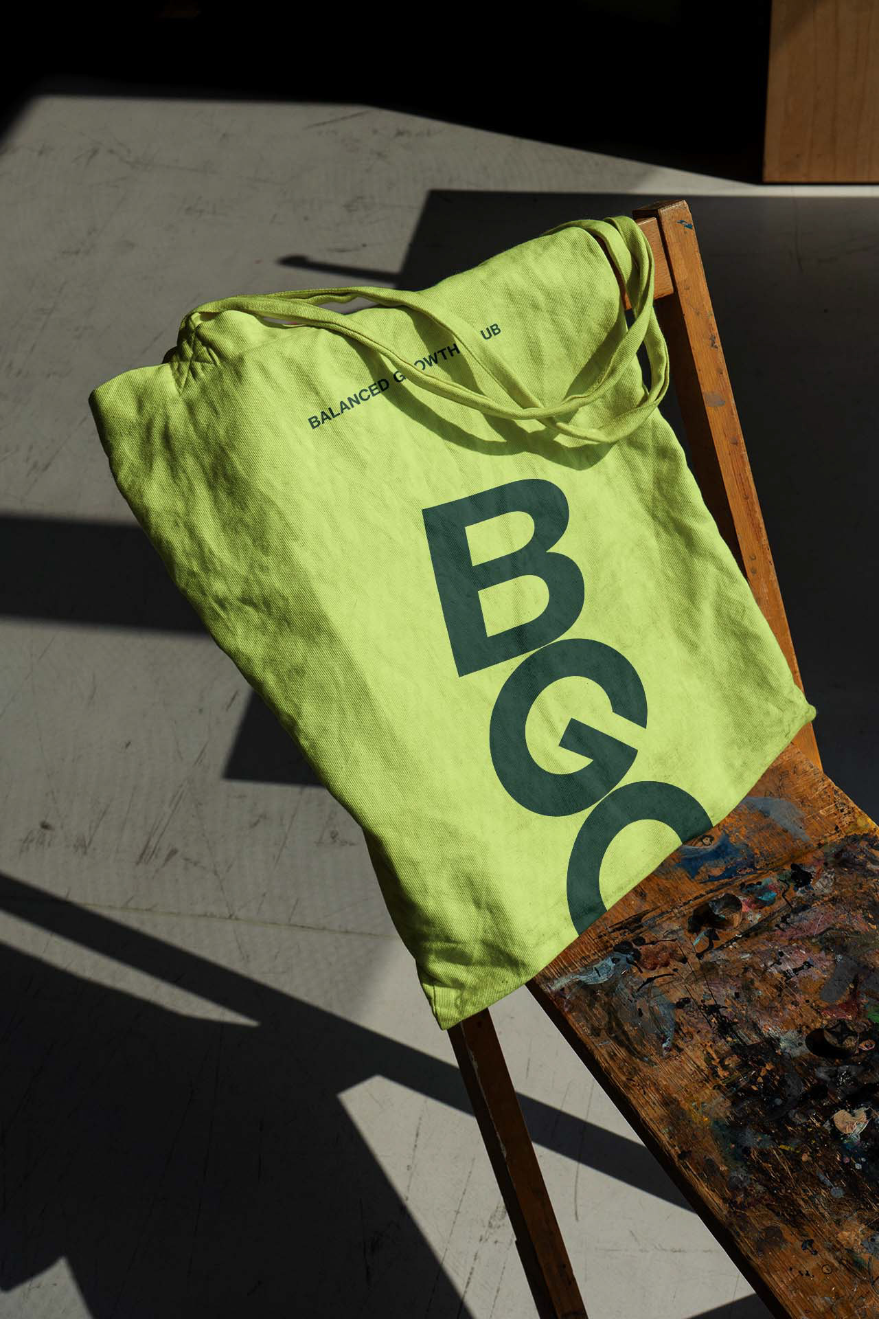
The B2B consultancy needed a visual identity that reflected their expertise in ESG matters as well as their belief in a better future. I created a new brand identity for them, along with a website and presentation template that would help reach new clients.
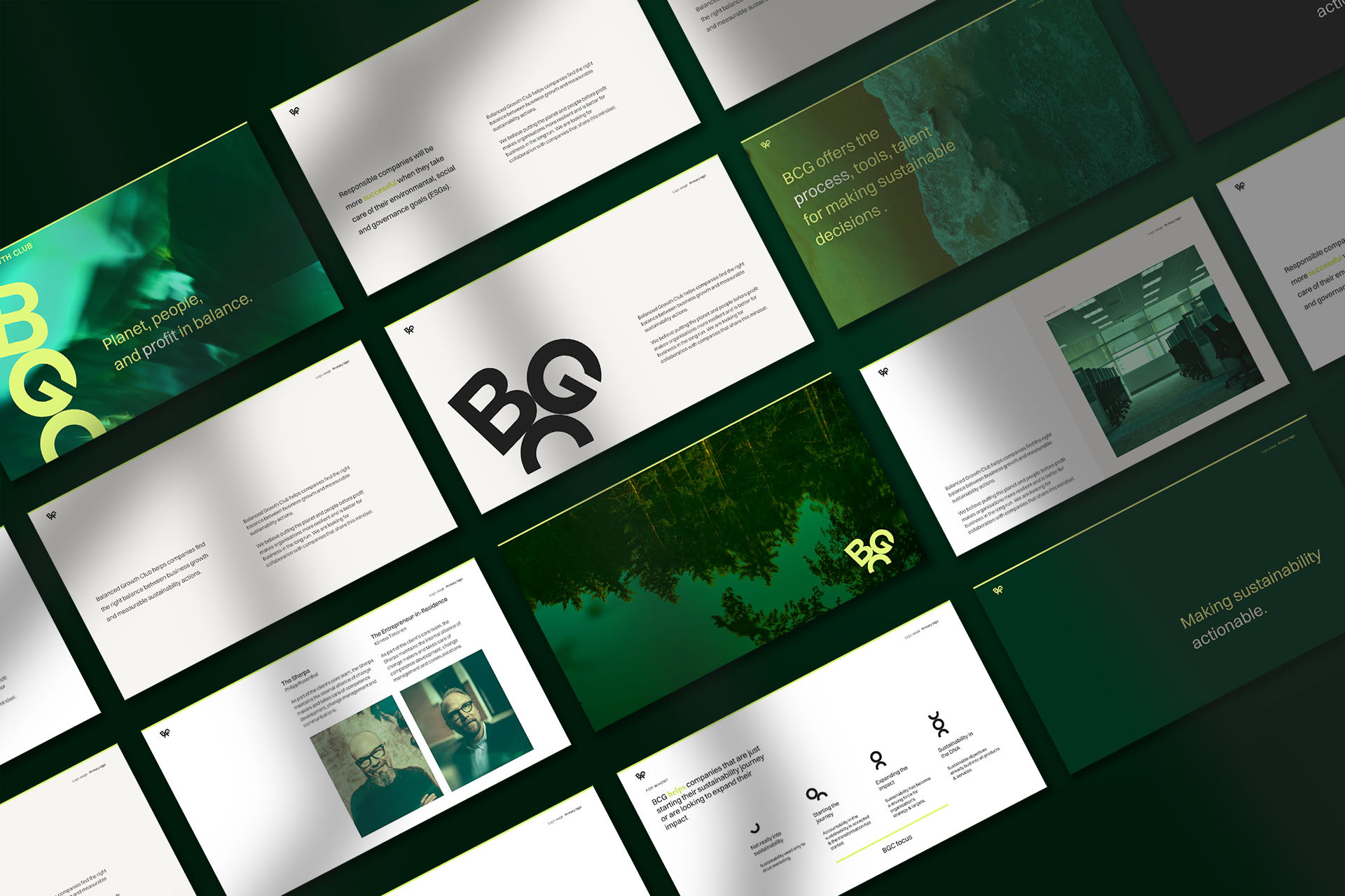
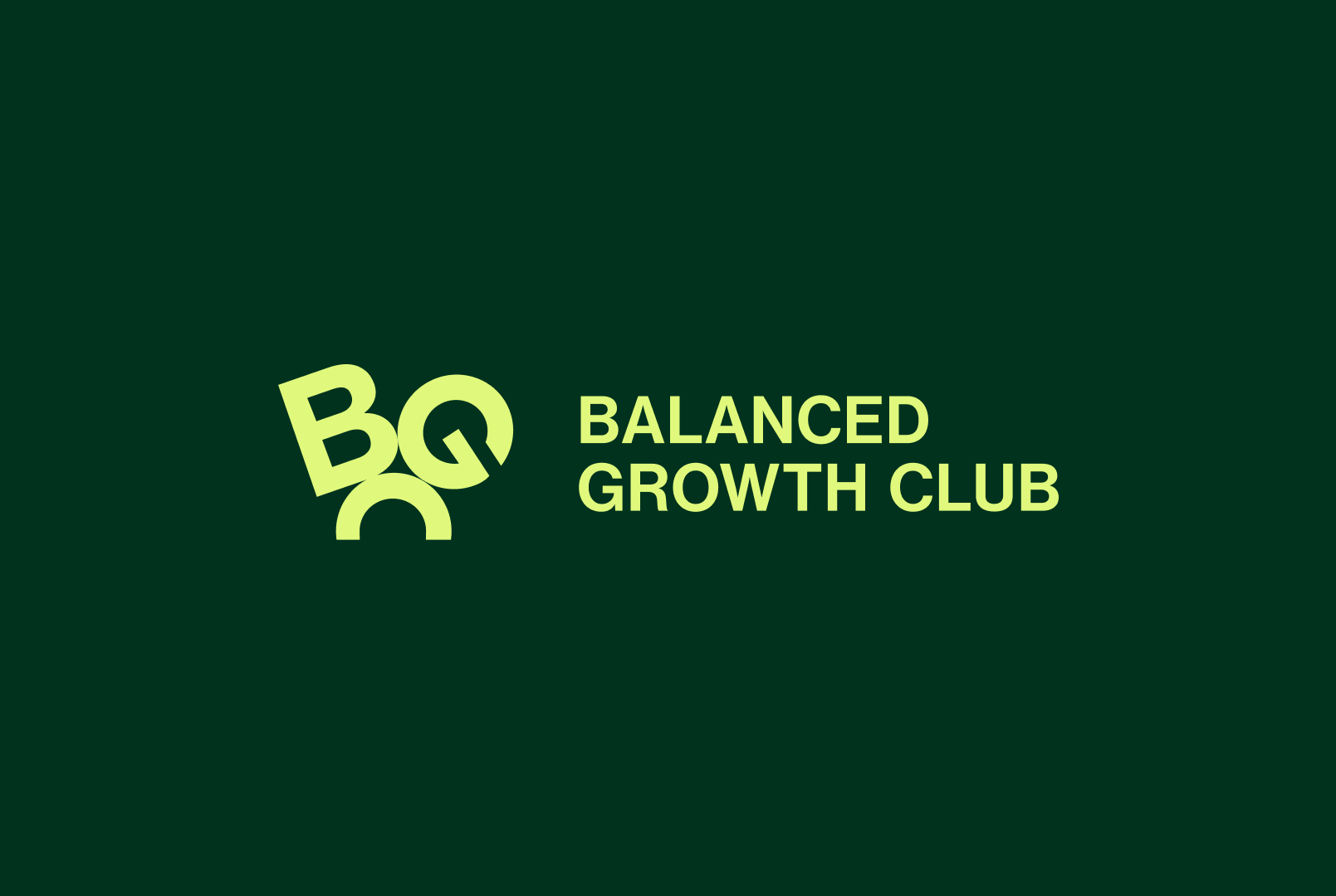
Because balance is at the center of what Balanced Growth Club does (and the name is a mouthful), I designed a logo where the letters BGC are balanced on top of each other in an upward growing stack. The stack can be varied for horizontal and square versions of the logo, allowing the balance to shift.
I used rounded letter shapes for the logomark, signifying a true balancing act, as round objects are difficult to balance. The roundness evokes Earth, the G on top of the semi-circle C looks a bit like a person and the growing stack represents profit – neatly encompassing the company's goal of keeping the planet, people and profit in balance.

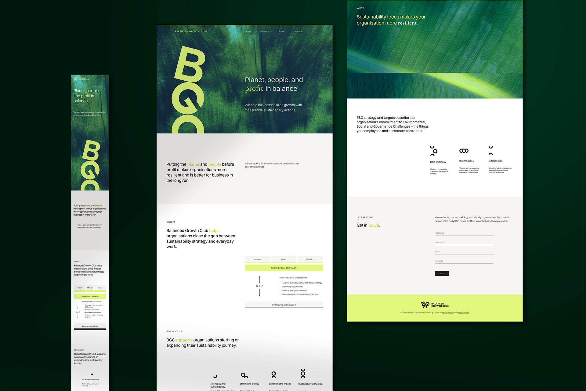
The logo mark served as a jumping off point for icons and movement, using abstract round shapes to illustrate ideas such as cost efficiency, risk mitigation and differentiation.
CREDITS
Concept, design and animation: Marita Koivisto
Web development: Mario Porpora
Business design: Laura Turkki