Building a brand over time
Helping Turku City Theatre become a recognizable player on the national stage
How do you build a recognizable brand with limited resources? This became my task over six years of working as the only in-house designer at Turku City Theatre, a large Finnish theatre company. TCT presented challenges specific to publicly funded repertoire theaters, producing 8-10 in-house productions and 60 visiting ones annually.
The sparse marketing resources were spread across a number of productions, with marketing efforts focusing more on individual productions than the theatre itself. As productions included everything from large-scale musicals to experimental theatre, dance and children's plays, a one-size-fits-all approach was not the best option.
The theatre had recently been rebranded, but the assets were based off the visual identity of the City of Turku and did not take into account the theatre's marketing strategy or marketing mix, so getting the theatre to stand out and be visually recognizable became a challenge.
After grappling with the new identity for a while, I started to define and shape the house brand together with the Sales & Marketing Manager and Communications Coordinator, and eventually created new brand guidelines to ensure marketing communications were consistent across different channels and productions.
Audiences buy tickets based on story and cast. Our marketing strategy focused on keeping the story of each play at the forefront.
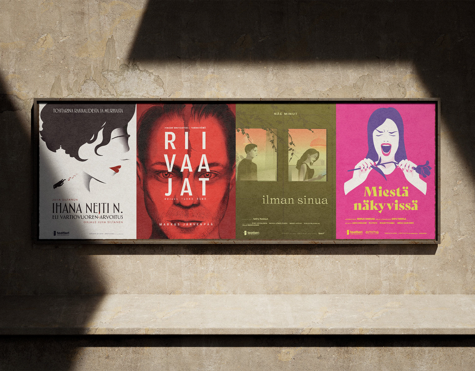
The merits of an identity present in all materials was considered, as it is a solution many theatre companies have adopted. However, repertoire theatres do not always have a say in how collaborations and visiting productions look and the quality of marketing materials varied greatly. Testing showed us it would be difficult to craft assets that would work with any style of material. I advocated for a minimalist solution that would work with any type of identity and still provide freedom of expression for individual plays. The solution became a grid that allowed for expression in the colors, key art and logo for they play, but was otherwise rigid, with logo placement, taglines, performer names and sales information consistently placed the same way.
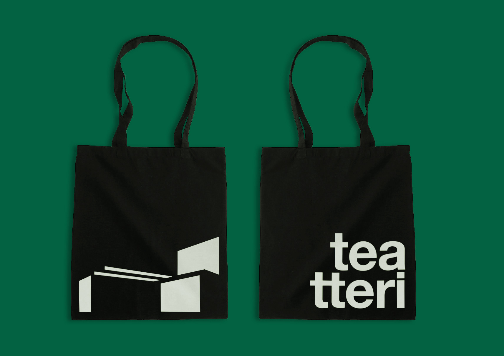
To help TCT develop its visual brand outside of individual productions, I set up guidelines for color usage and created a series of multicolored patterns that could be used on their own or inside graphic shapes. Since the theatre needed to adhere to WCAG accessibility guidelines, black and white became the primary brand colors, ensuring contrast and legibility. This minimalist approach suited the theatre, which operates in a sculptural 60's building and was already using a modernist typeface and logo.
The 1960's and Modernist design became the guiding notion in developing the brand. The theatre building had recently been remodeled and restored to its former glory, so it felt right that the brand celebrate the history of the theatre. A graphic element was needed to help the theatre become more recognizable as a brand, particularly when advertising in digital channels.
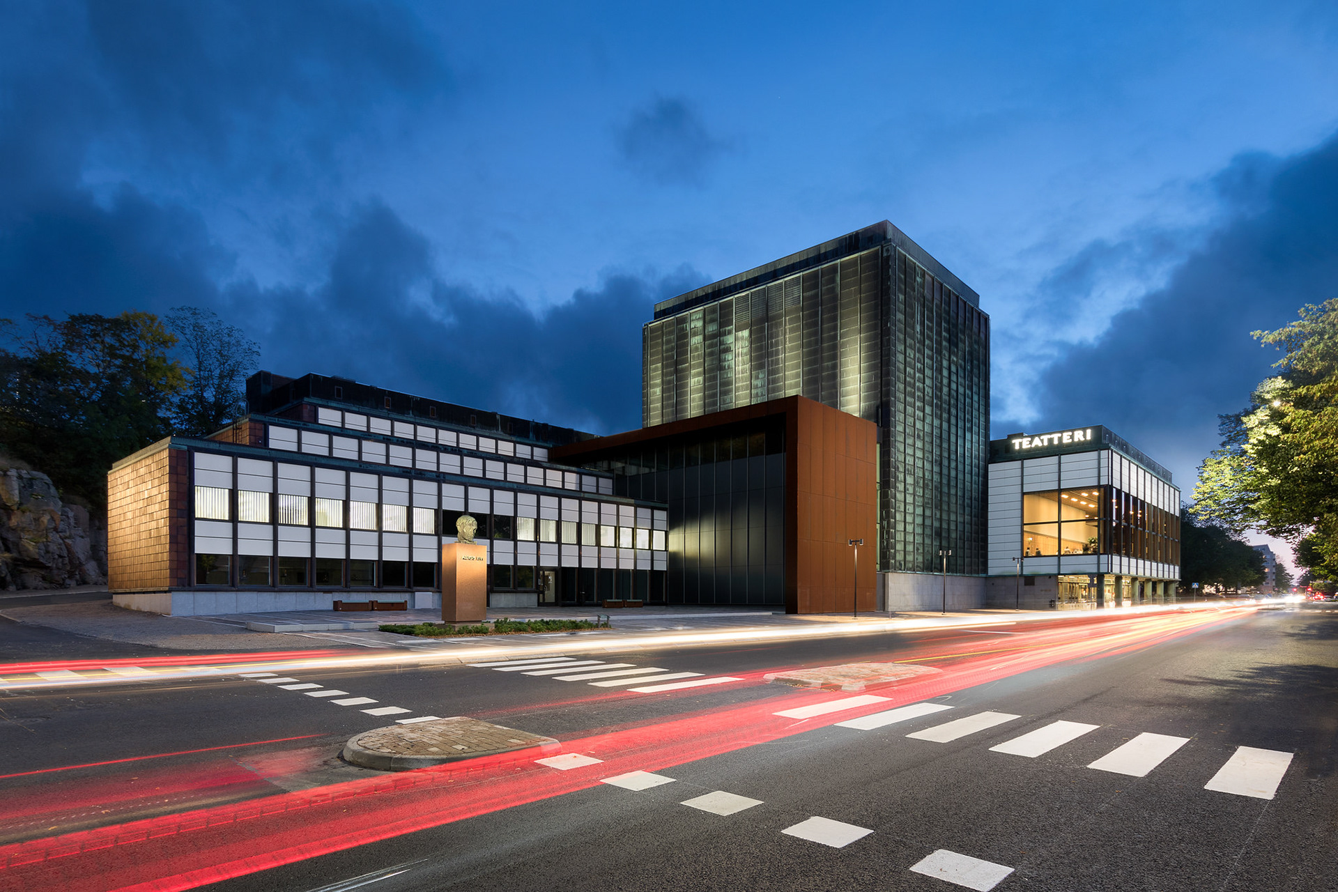
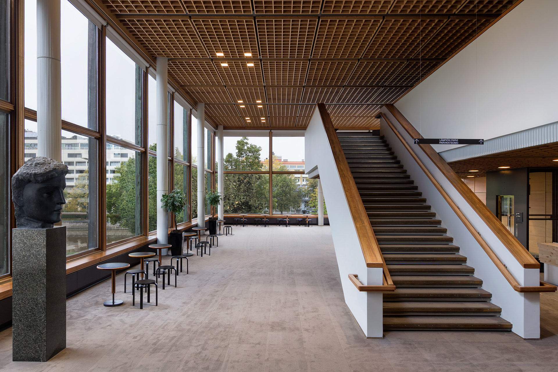
Rectangular and square grids can be found all over the theatre building, from the minimalist wooden inside ceiling to the terracotta tiles and white panels on the outside walls. This rectangular grid ended up being used as a base to form two graphic patterns that could be used in alternating colors and cropped as needed.
The grid and patterns became recognizable elements that could be used in a multitude of ways across both print and digital, drawing the eye to the content of ads. The patterns worked on their own and for framing images. In social media, which was the most playful arena, I used the grids and patterns to cut into graphics and to form and fill shapes.

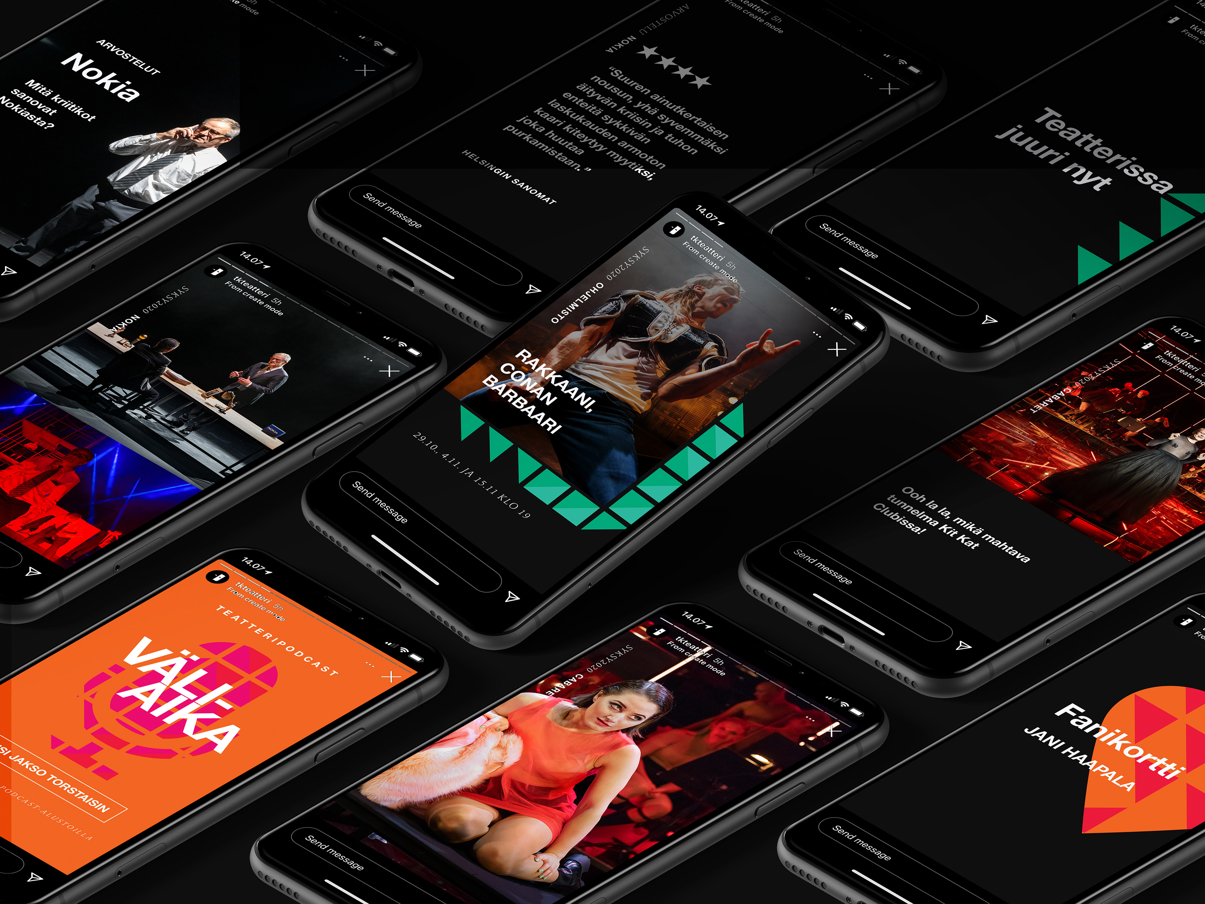
Theatre engages all senses, and so does the brand. We wanted to go beyond the visual and verbal in brand building, defining motion and audio styles to strengthen connection.
The straight lines and grids of the theatre building did more than inform the design of the colourful geometric brand patterns, they also influenced the design of the motion for the brand. Graphic movement followed the straight lines of the architecture, smoothly moving in and out, with sharp 90° or 180° turns. The gridded pattern could flicker and the fill of the pattern could move and change, just like the lights and set pieces on a theatre stage.
To further develop the recognizability of the brand, I worked together with sound designer Eero Auvinen to develop a custom sound for the brand based on the music that inspired the modernists. The result was a moody, jazz inspired sound utilizing rhythm and wind instruments, nodding back to the 60's without feeling out of date. Instruments and melodies could be added on top of the rhythm to change the tone and mood, depending on the subject being advertised. The theatre's podcast was given its own, happier melody – while ads were more toned down and dramatic.
Custom icons help audiences find what they are looking for.
Icons were custom created for the theatre, reflecting the modernist style of the brand. Adjustments such as rounded corners and curved details gave the brand an approachable and friendly air.
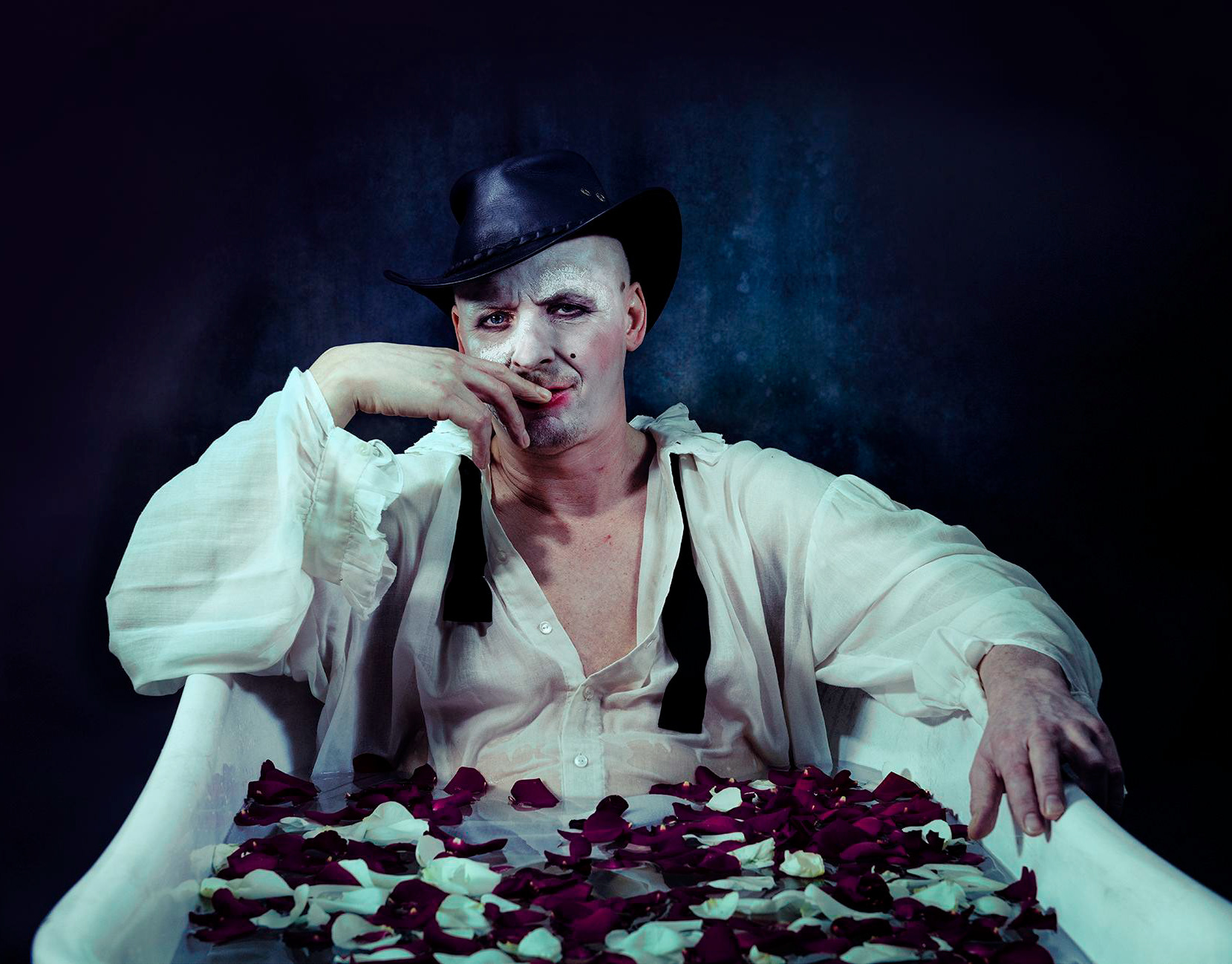
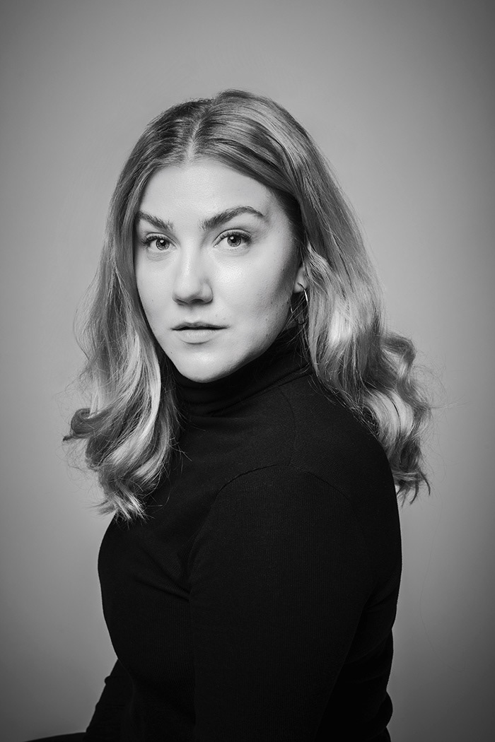
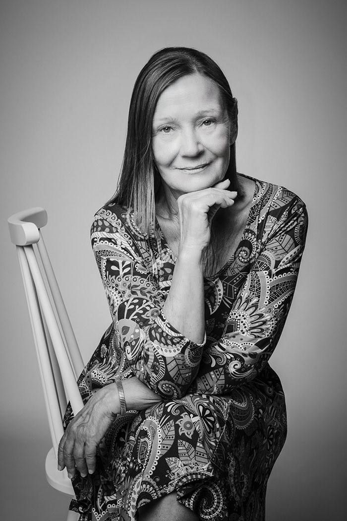
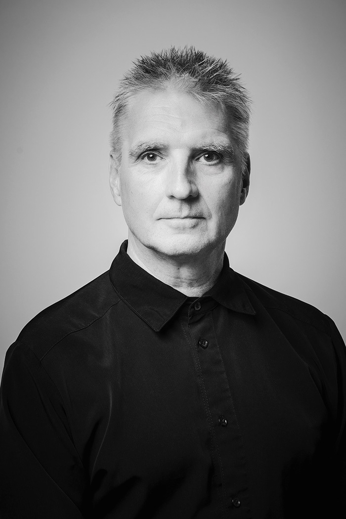
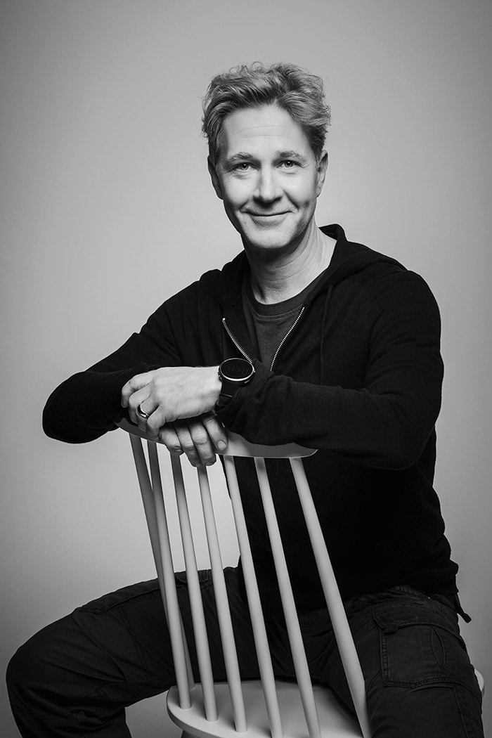
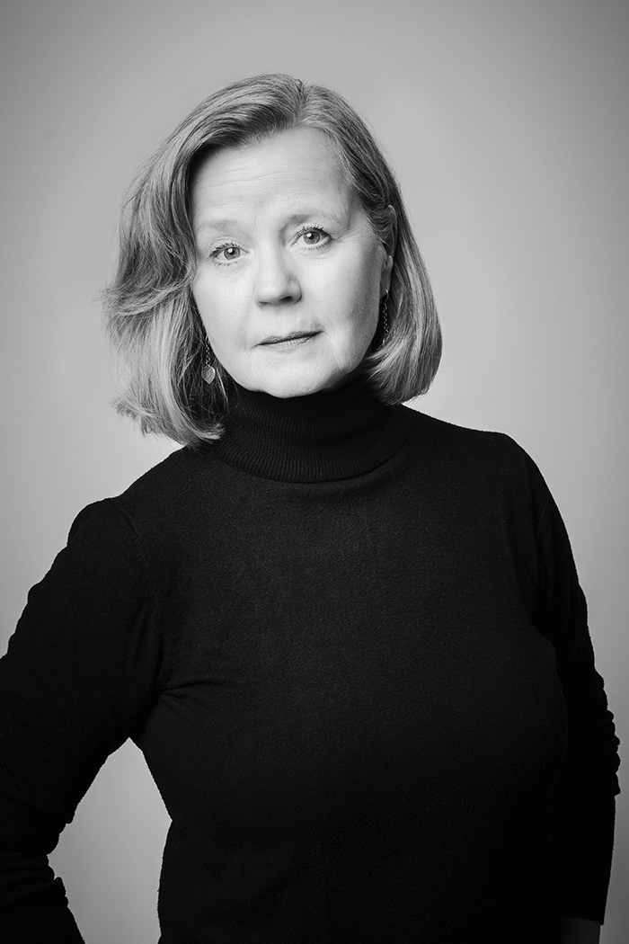
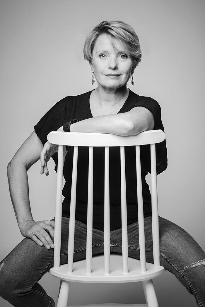
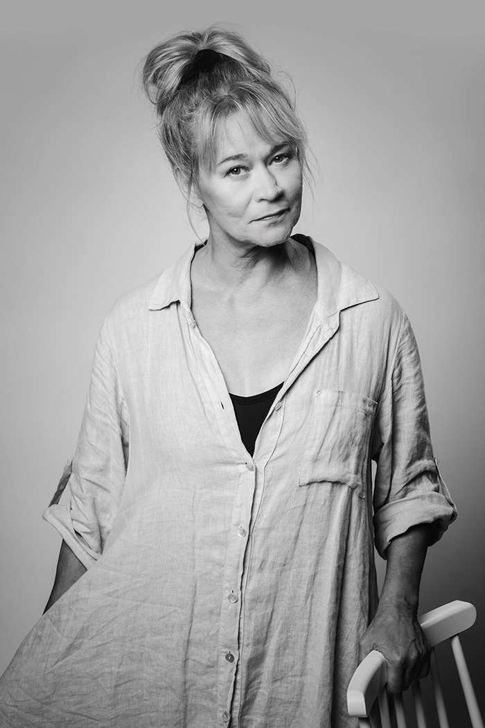
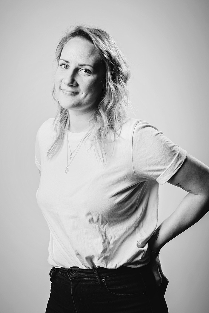
What is a theatre without its people? I commissioned and art directed a new set of portraits of actors key staff to go with the new brand visuals.
The passionate individuals that made up the theatre had not been photographed in almost 10 years. In 2022, the theatre commissioned a new set of 40 portraits to celebrate the staff that make performances happen. The portraits style was developed in collaboration with photographer Otto-Ville Väätäinen, who has worked as the designated photographer for Turku City Theatre for nearly 10 years.
I wanted staff portraits to continue the drama in stark black and white – reflecting the primary brand colors. This helped separate the portraits from other house photography, and made it easier to maintain a cohesive style as new actor portraits would be needed with frequent intervals. Staff were given a say in how they were photographed, as we wanted each individual to feel to recognize themselves in their portraits. The approach gave wonderful variety and natural results, avoiding overly posed or theatrical photos.




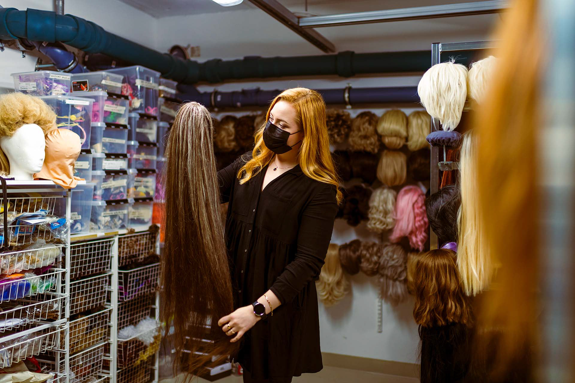
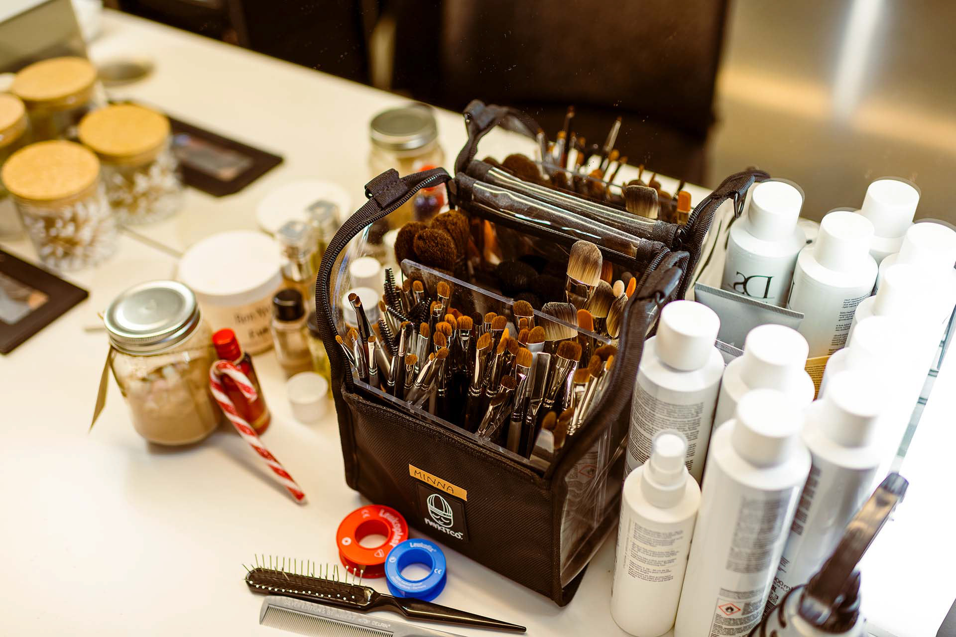
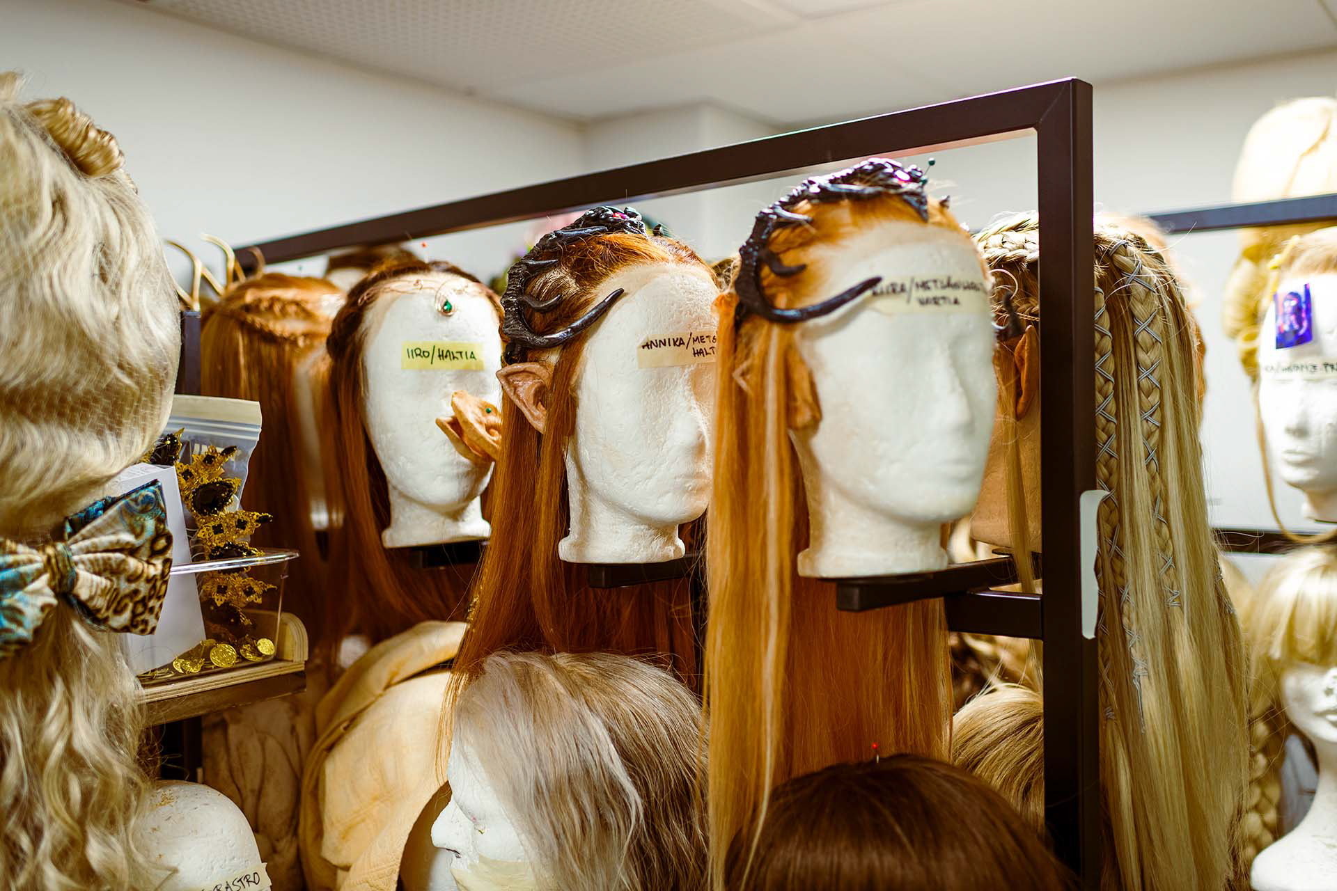
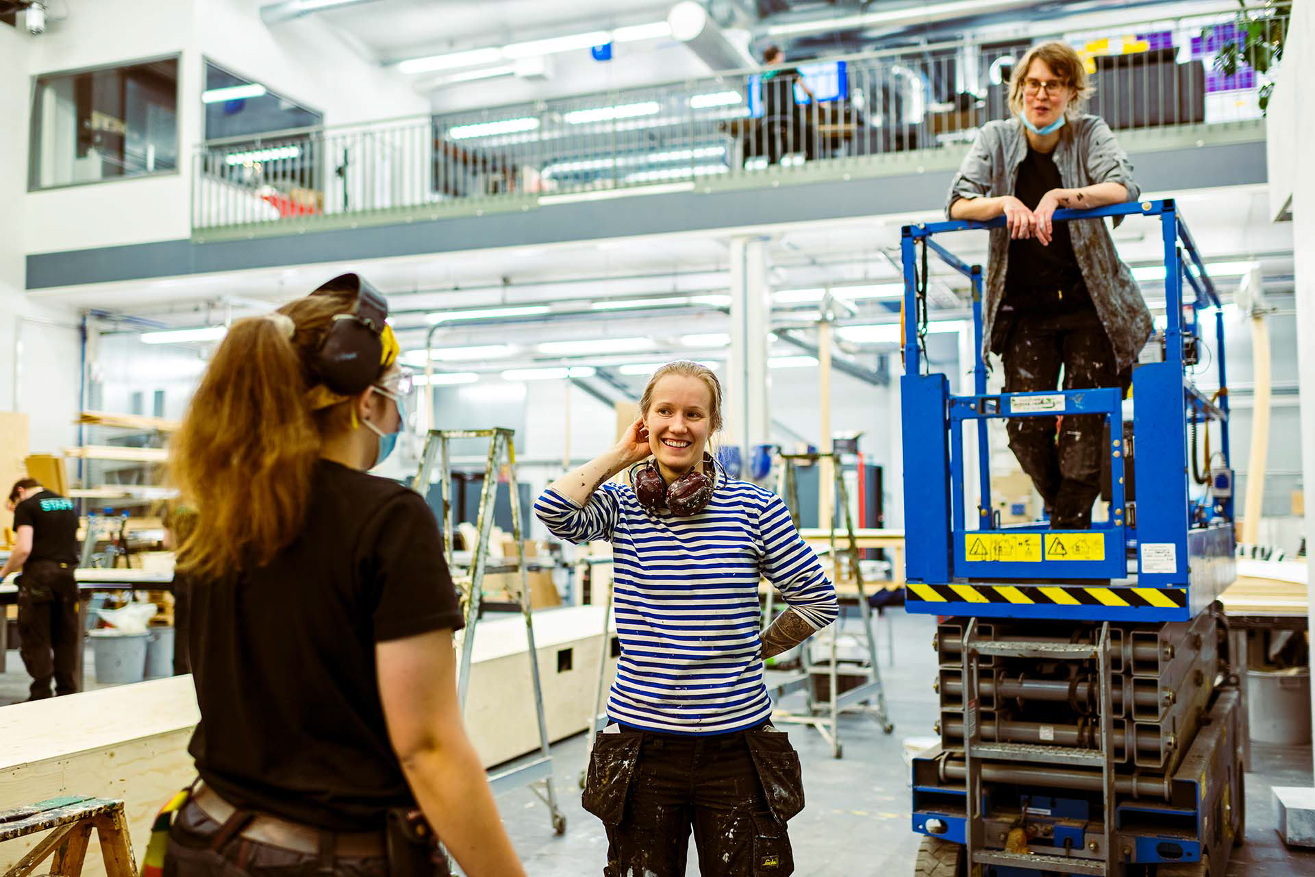
During COVID19, the performing arts industry took a hard hit. Theatre's were shut down for long periods of time, and upon reopening there were numerous limitations. During this time of distress and duress, voices of dissent questioned the financial support given to performers and theatres. We set out to document and show the hard work and passion that goes into a play through a series of photographs. I wanted images to be unposed and natural, showing staff at work in different departments building sets, adjusting costumes and doing maintenance.
Our photography partners Otto was given free reign of the building, documenting a day at the theatre through the lense of his camera.
