UI/UX design for the web
Redesigning a theatre website to drive sales and conversion
Client: Turku City Theatre
Project: Website redesign
Year: 2021
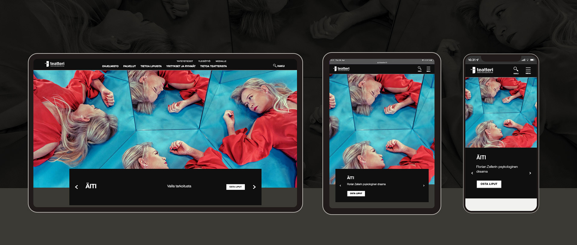
Turku City Theatre was in need of a complete redesign of their website, as the platform was nearing the end of its lifetime. The theatre had been burdened with a Drupal based website developed for public organisations, not for event production and ticket sales. While working at the theatre, I teamed up with Karhu Helsinki to renew the site.
The old site was functional, but did not serve the particular needs of a theatre company. Larger theatres house events (press events, panel discussions, workshops) and guided tours as well provide teaching materials, send out weekly newsletters and run their own cafe and restaurant. Turku City Theatre also livestreamed events and published a monthly recurring podcast. The structure of the website did not support promotion of most of these activities, and the site also did not comply to accessibility standards.
The UX of the site was completely rebuilt to better structure relevant information and to boost ticket sales and audience participation. Karhu Helsinki was consulted during the design process to ensure adherence to best practices and accessibility standards.
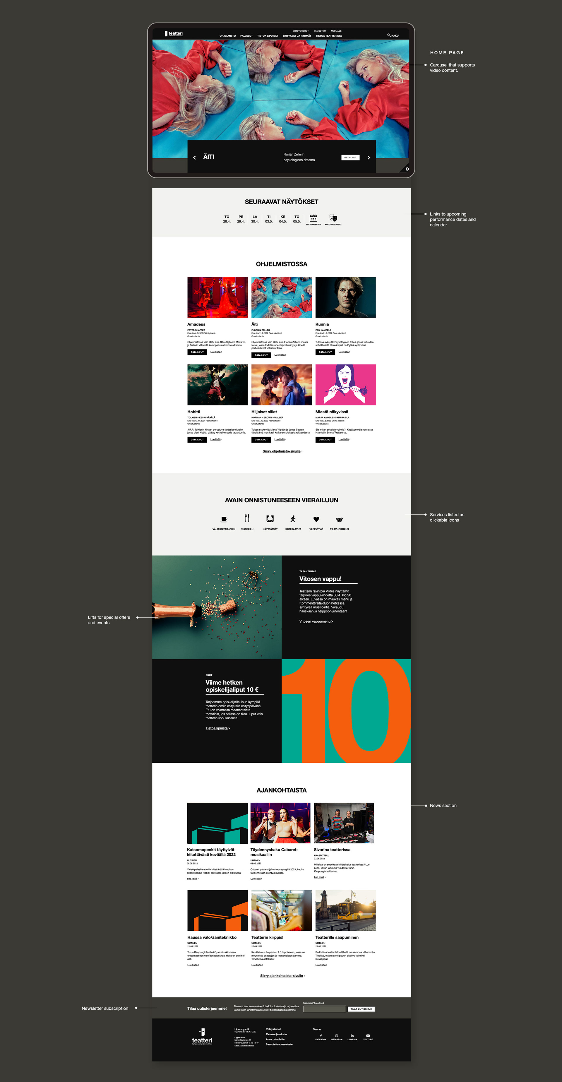
Our guiding light simple: make it easier for the audience to find what they are looking for.
We set out with four overarching goals for the new site:
- Guide the user along the sales funnel, providing enough information to nudge purchase decisions
- Improve the possibilities of promoting audience outreach events
- Create a platform for publishing cast interviews, articles and press releases – guiding traffic from newsletters and social to the website
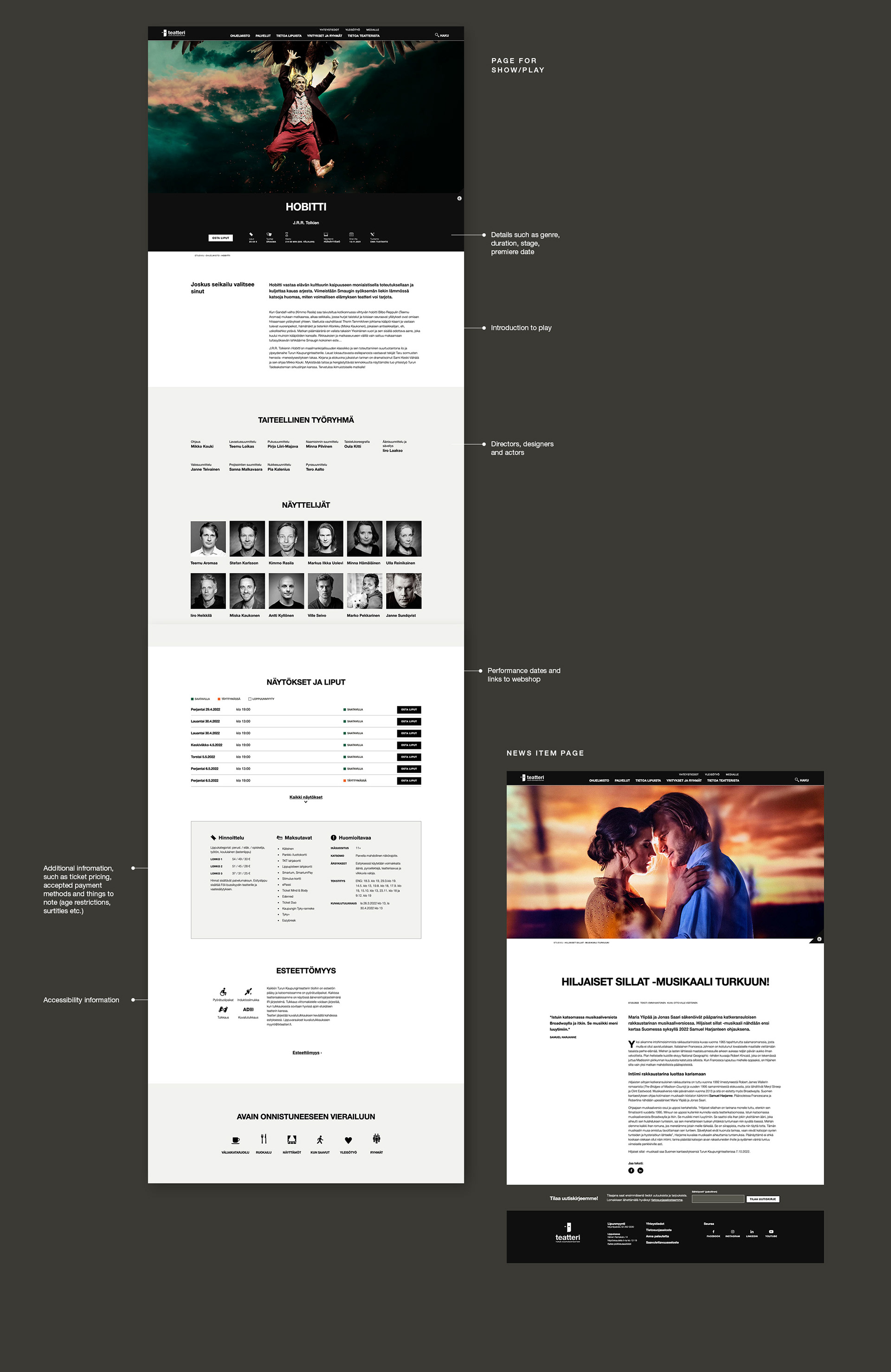
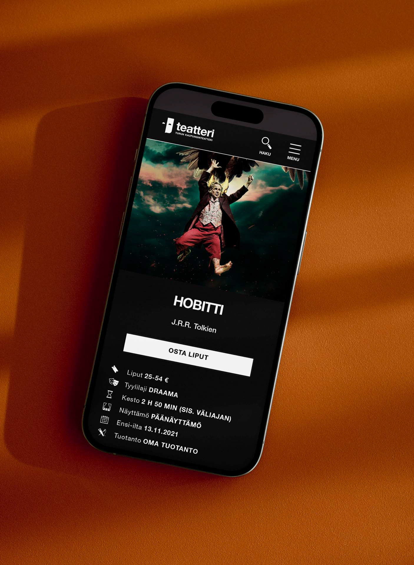
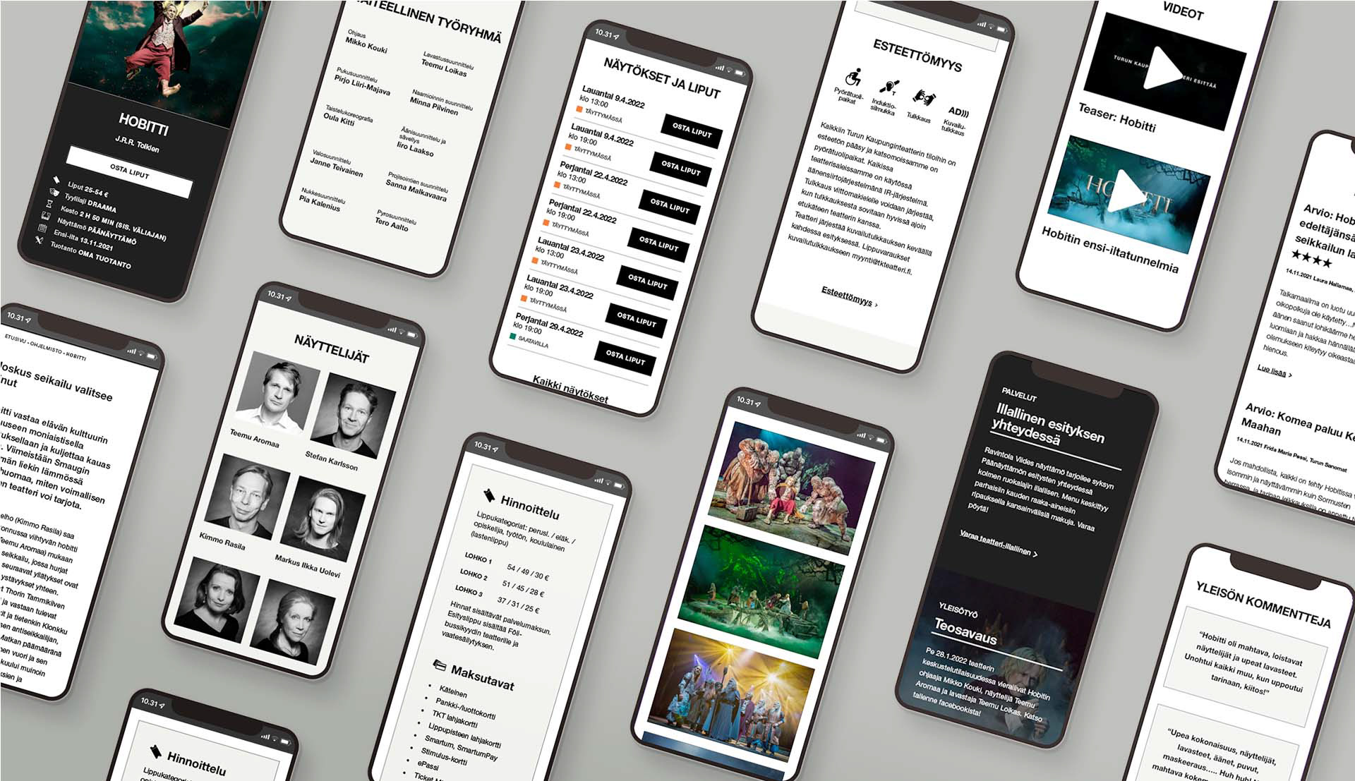
- Provide a more comprehensive and versatile way of presenting information about plays (including artistic team, cast, trailers, image gallery, accessibility as well as reviews, articles, interviews and related events).
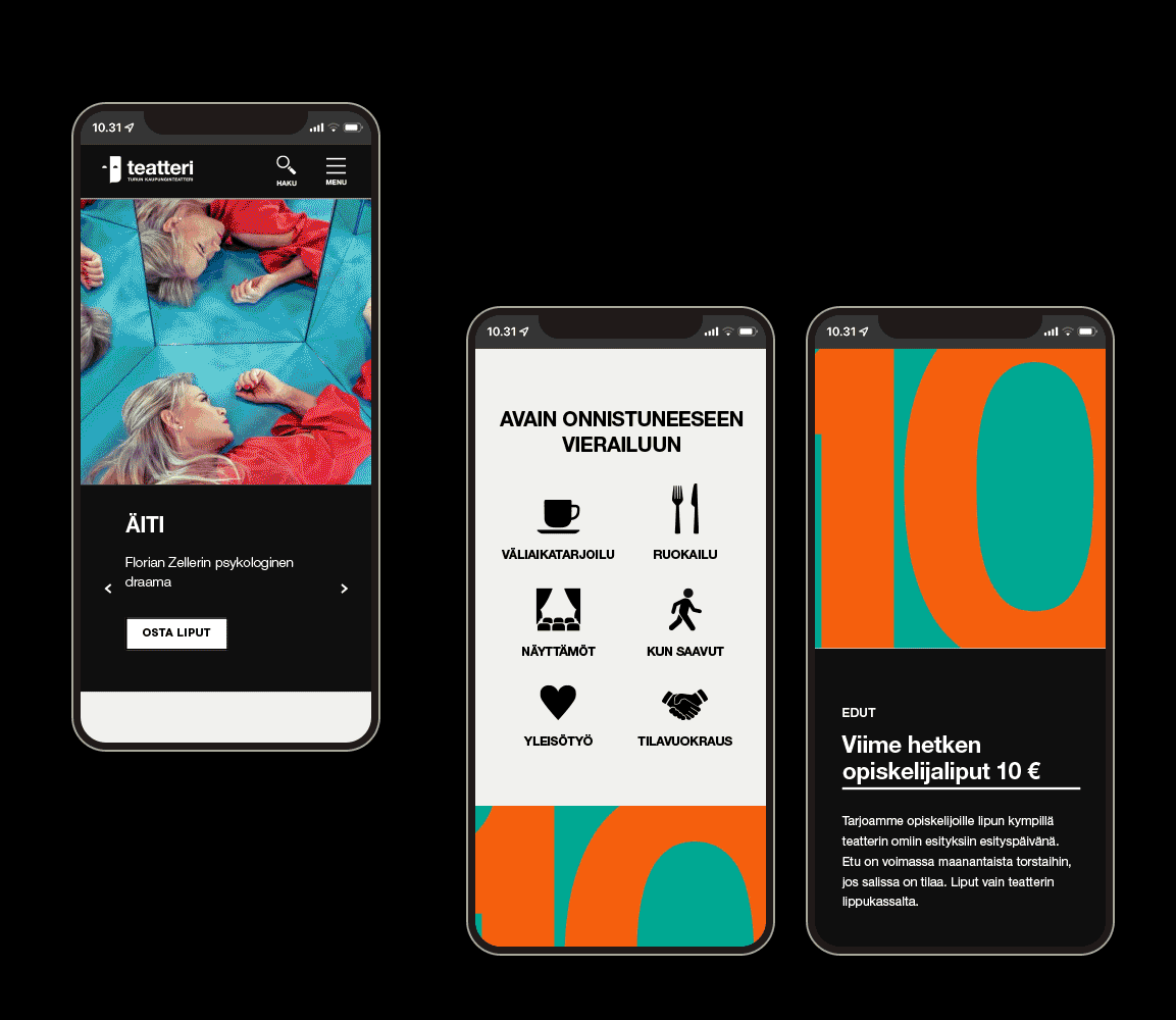
How did we achieve this? The site was redesigned with a restructured navigation, a more mobile friendly and more accessible design, clear CTAs, various modules for different feature sections, a platform for blog articles, an improved search function and all new event calendar. The site was structured with automated modules that made sure there was always more relevant content available to keep interested users engaged on the site.
The page template for events was redesigned to help structure the information and create hierarchy. Sections for reviews and testimonials were added, allowing users to read what others thought of the play before committing to a purchase decision. Image galleries and video trailers helped entice audiences and give them a taste of the play in advance.
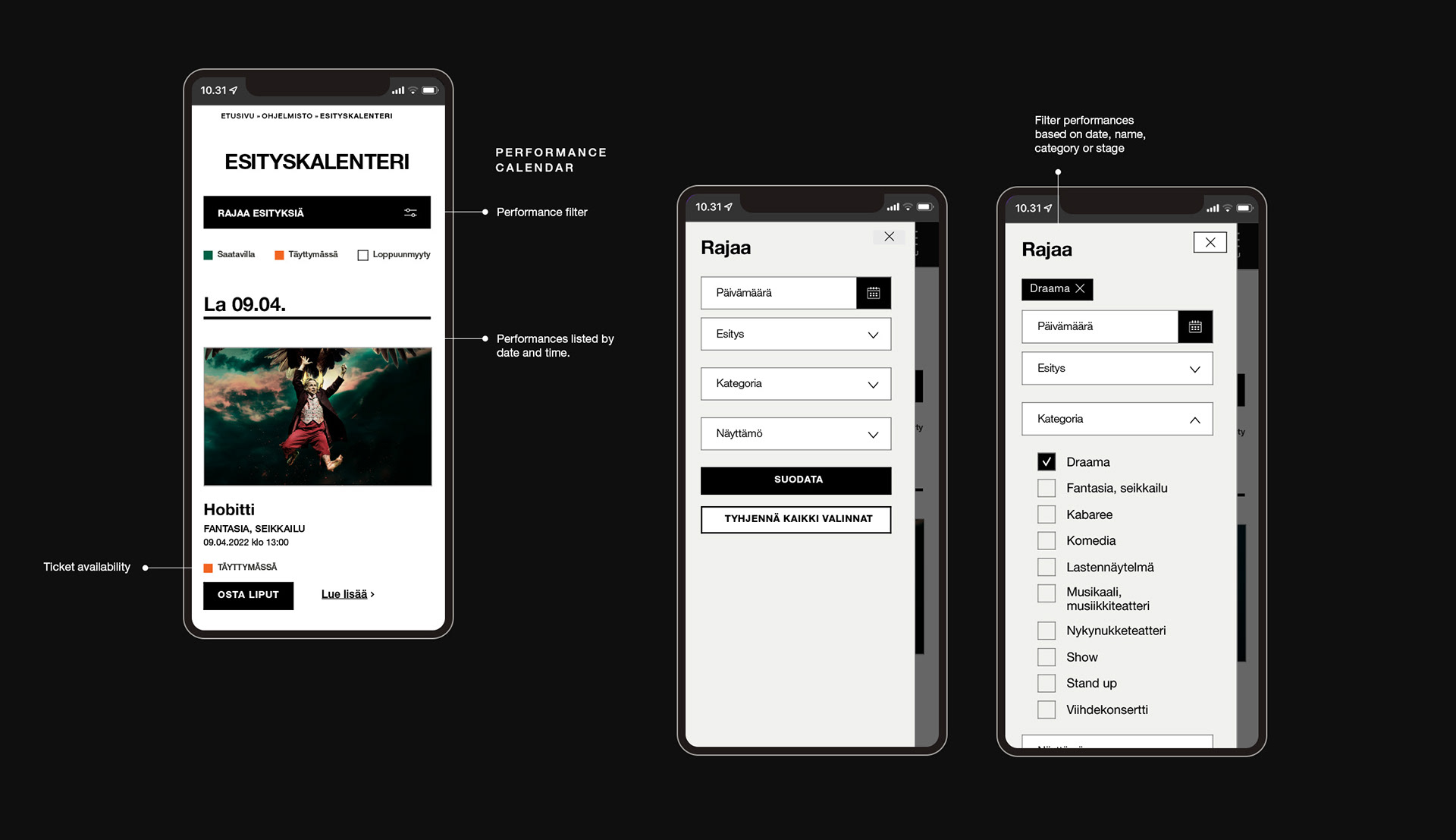
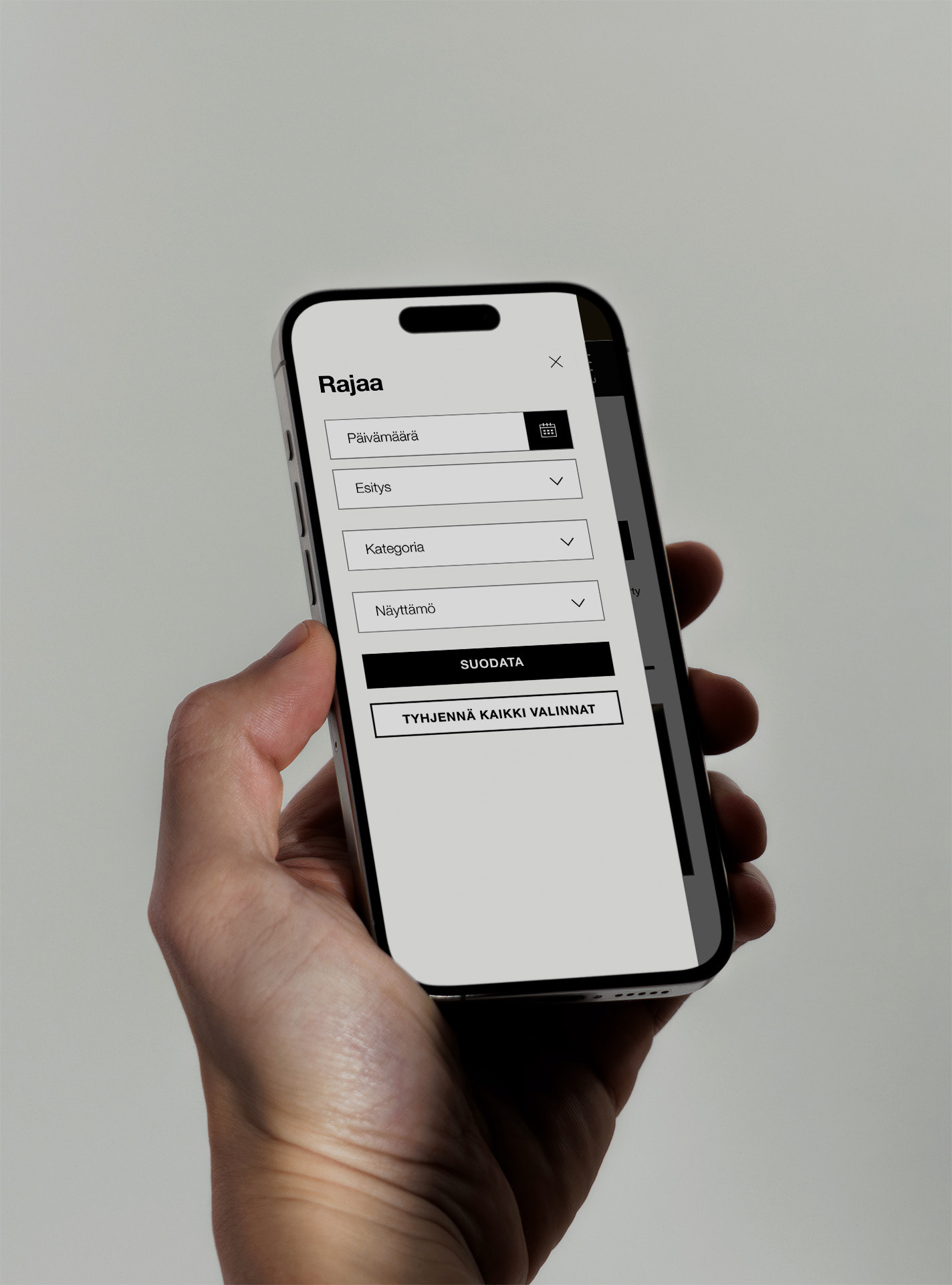
Finding the right event for you
The theatre did not have a properly functioning calendar of performances, making it difficult for customers to know what plays were running at what dates. The calendar was redesigned so performances could be filtered based on the date, name or genre of the performance, as well as the stage it was set on. Users were guided to the calendar directly from the home page. The calendar employed a traffic light model to display ticket availability, encouraging users to act fast when shows were selling out. Clear CTAs directed users to buy tickets once they found the right event for them.

CREDITS
UI/UX: Marita Koivisto
Project management and site development: Karhu Helsinki